Project
Estúdio Gustavo UtraboA Brazilian architecture office based in São Paulo and Chicago, USA.
CategoriesDigital Design, Brand Identity
Published2022
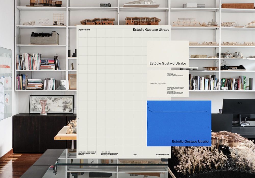
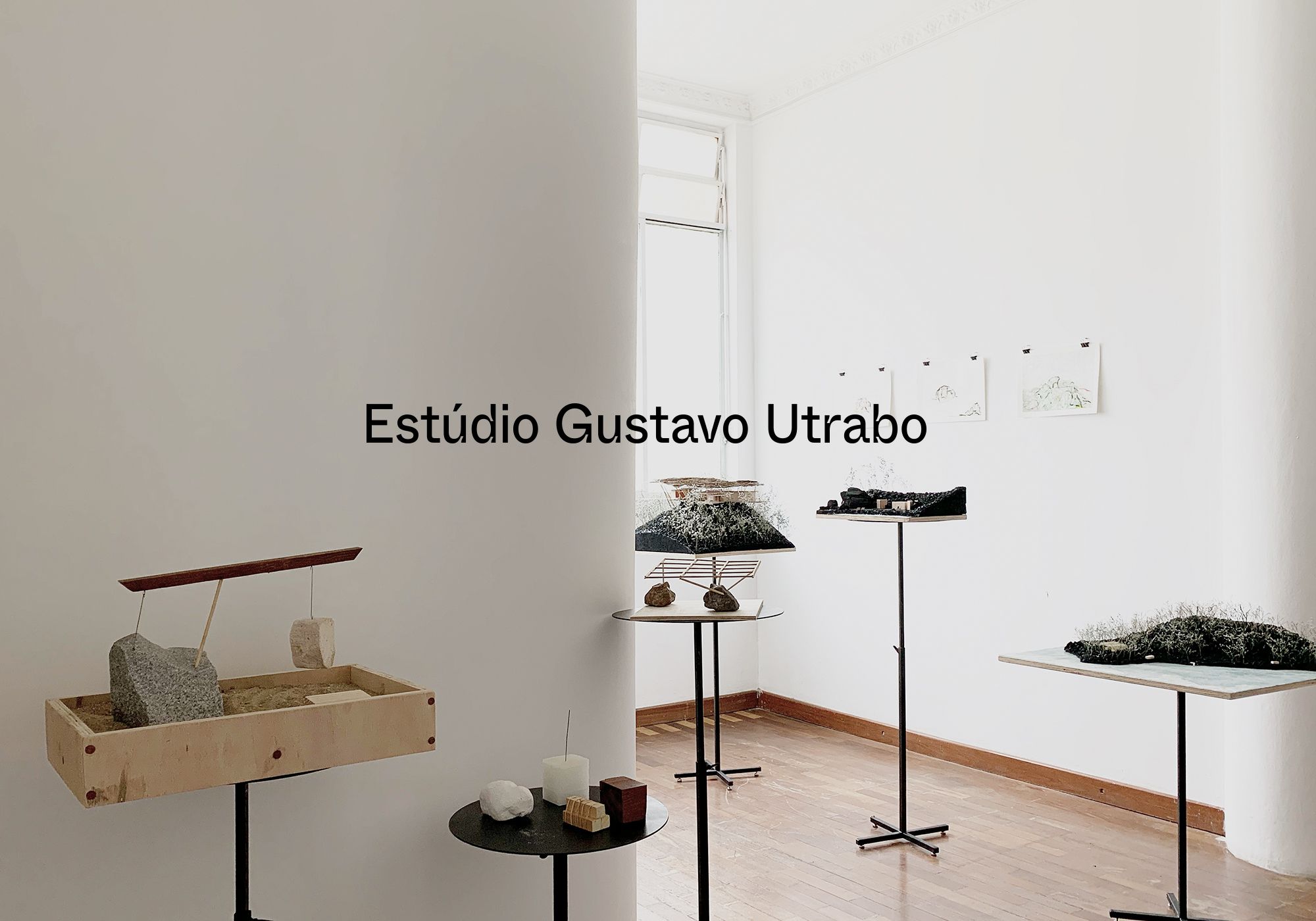
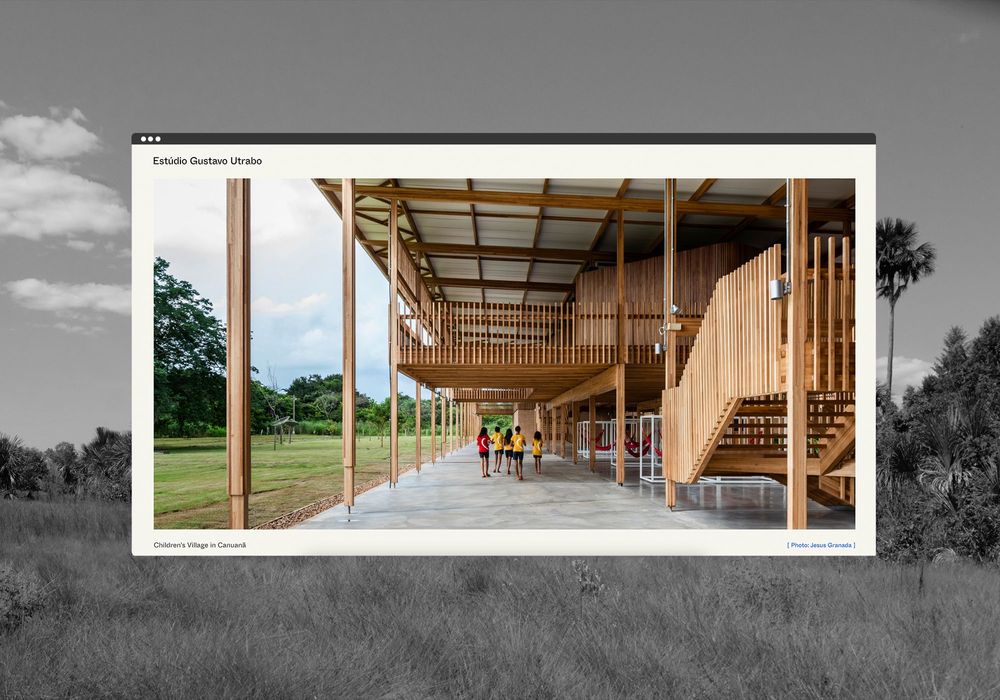
Gustavo asked us to recreate his brand, visual identity, print collateral, online
a timeless showcase of his work to dateHis method to envision the best solution to a project experiments and explores varied art disciplines such as photography, painting and sculpting to conceptualize an idea.
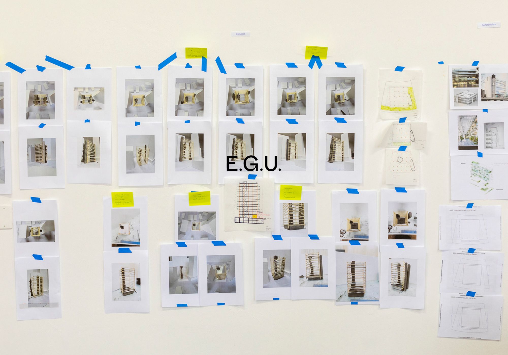
The rebrand was inspired by his creative journey highlighting his art and documents
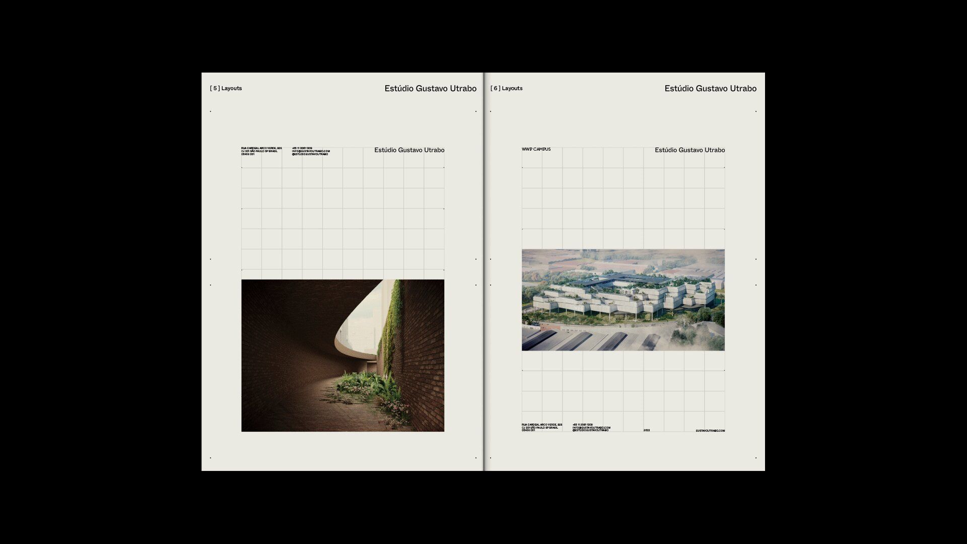
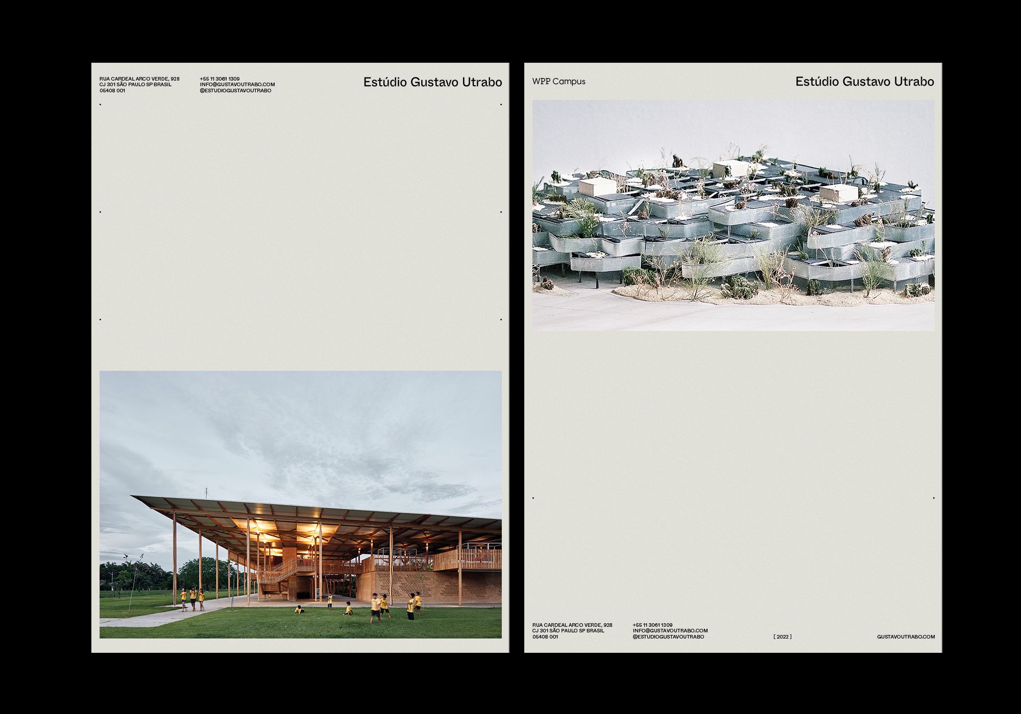
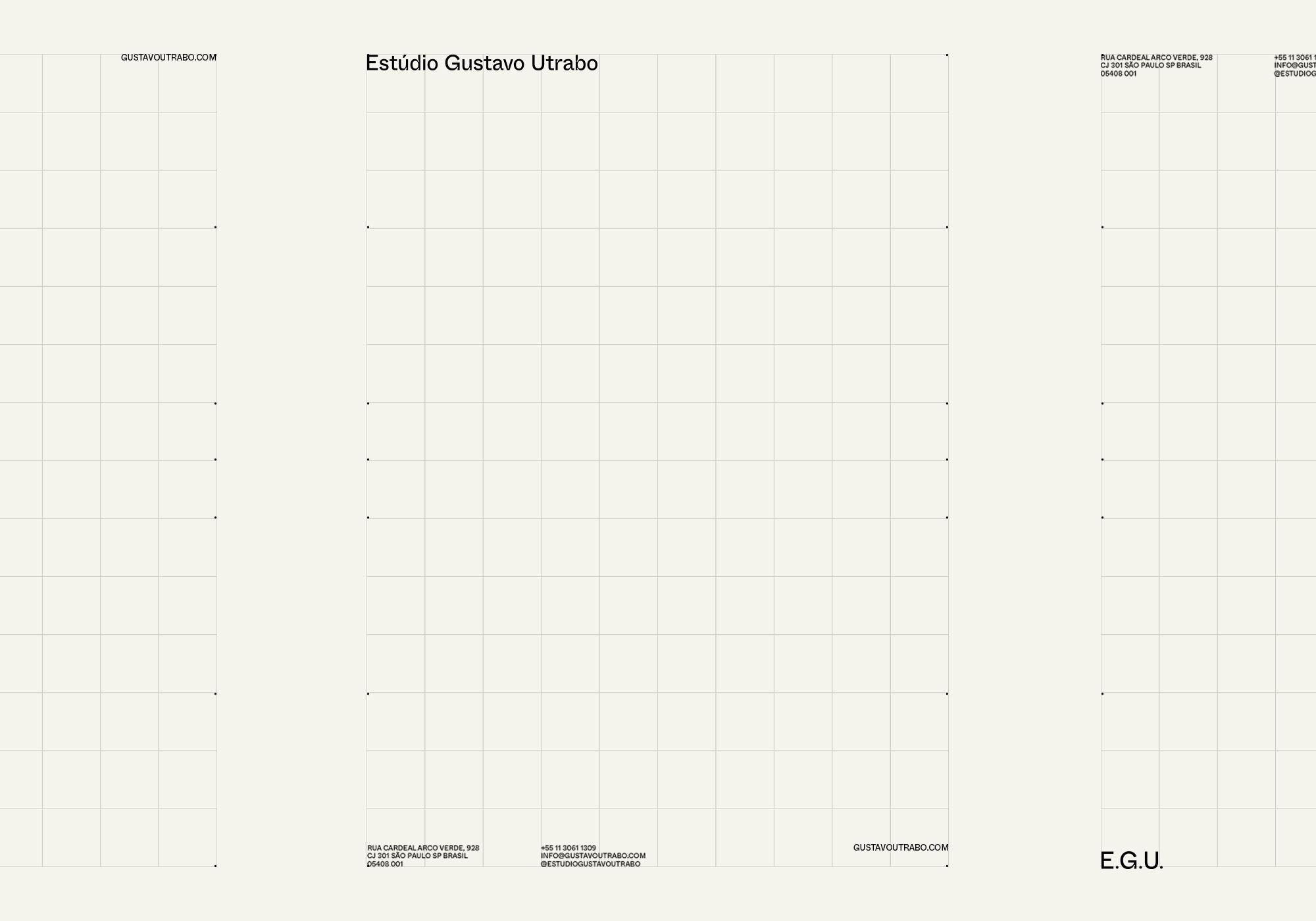
communication and identity like an art galleryThe graphic designs act in a supporting role to his photography, artworks, 3D renderings and projects. The grid is modular, working with little points to orient the distribution of information and alignment to keep the balance between type and image.
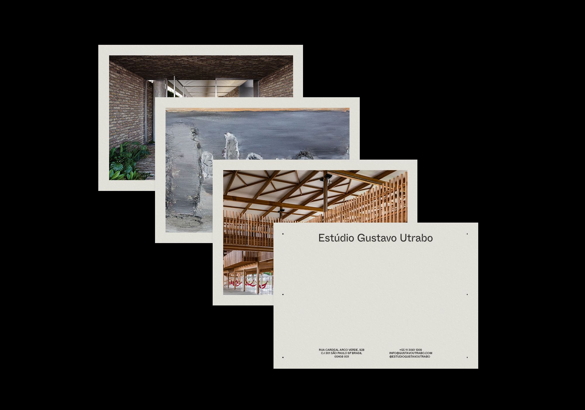
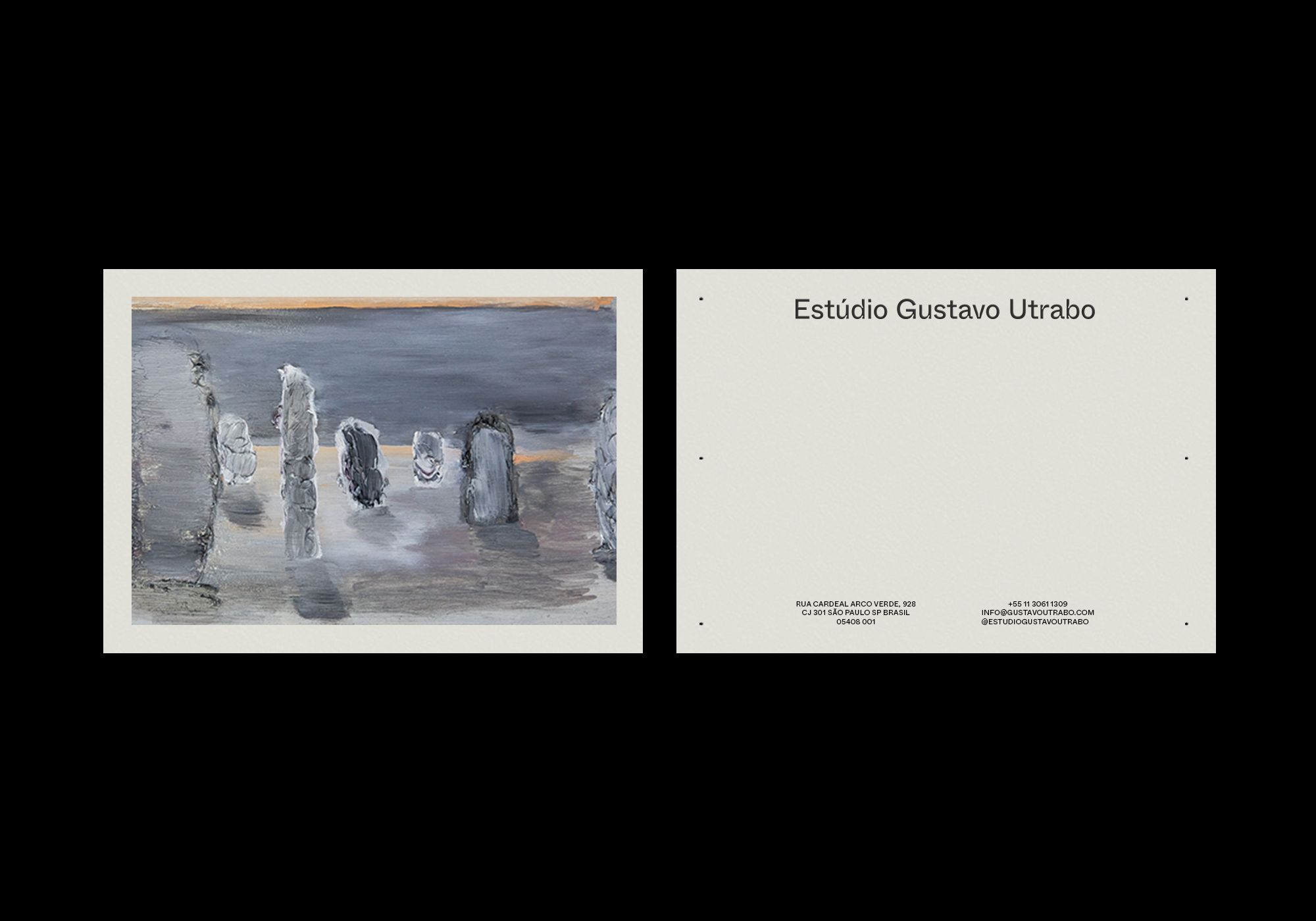
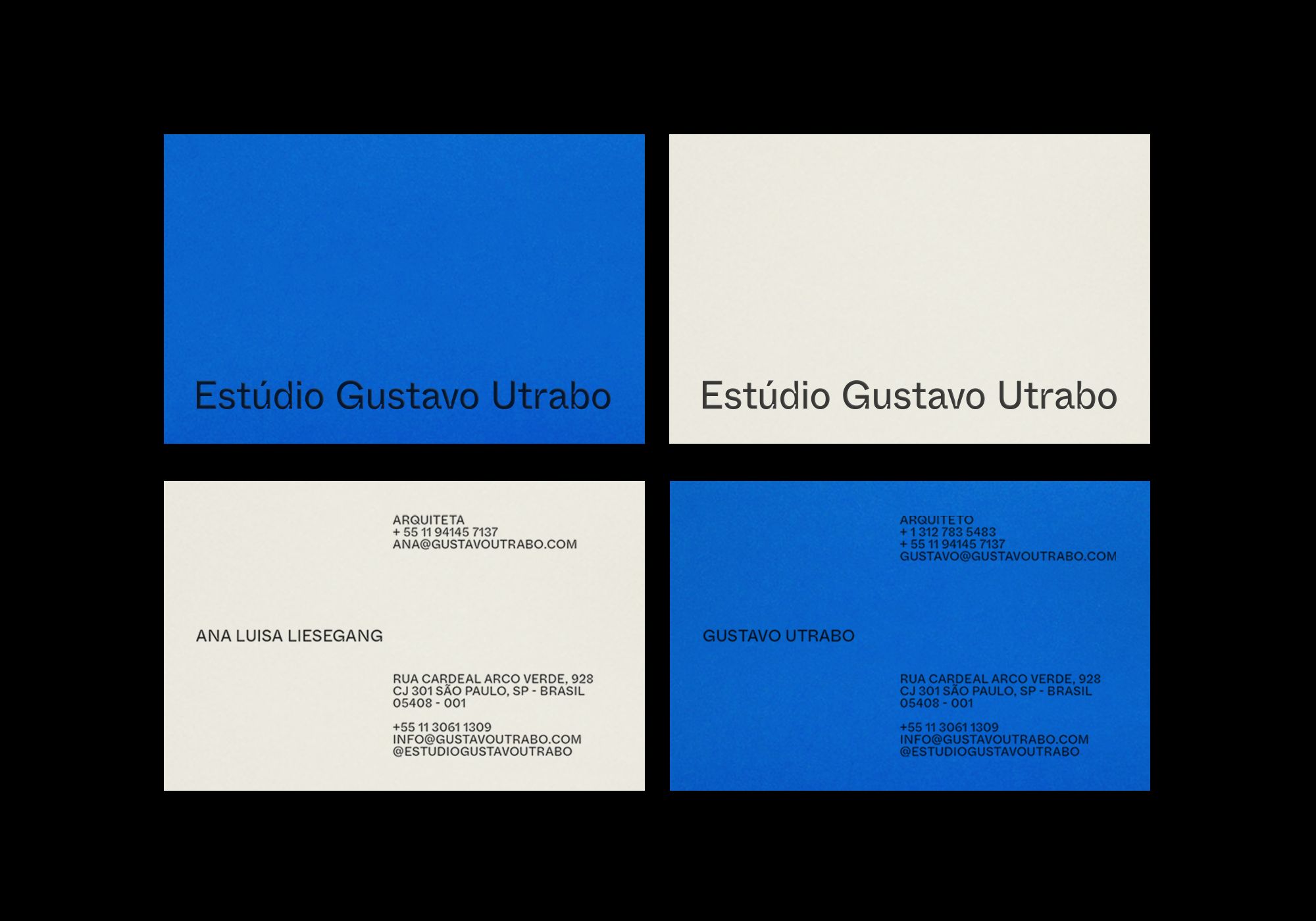
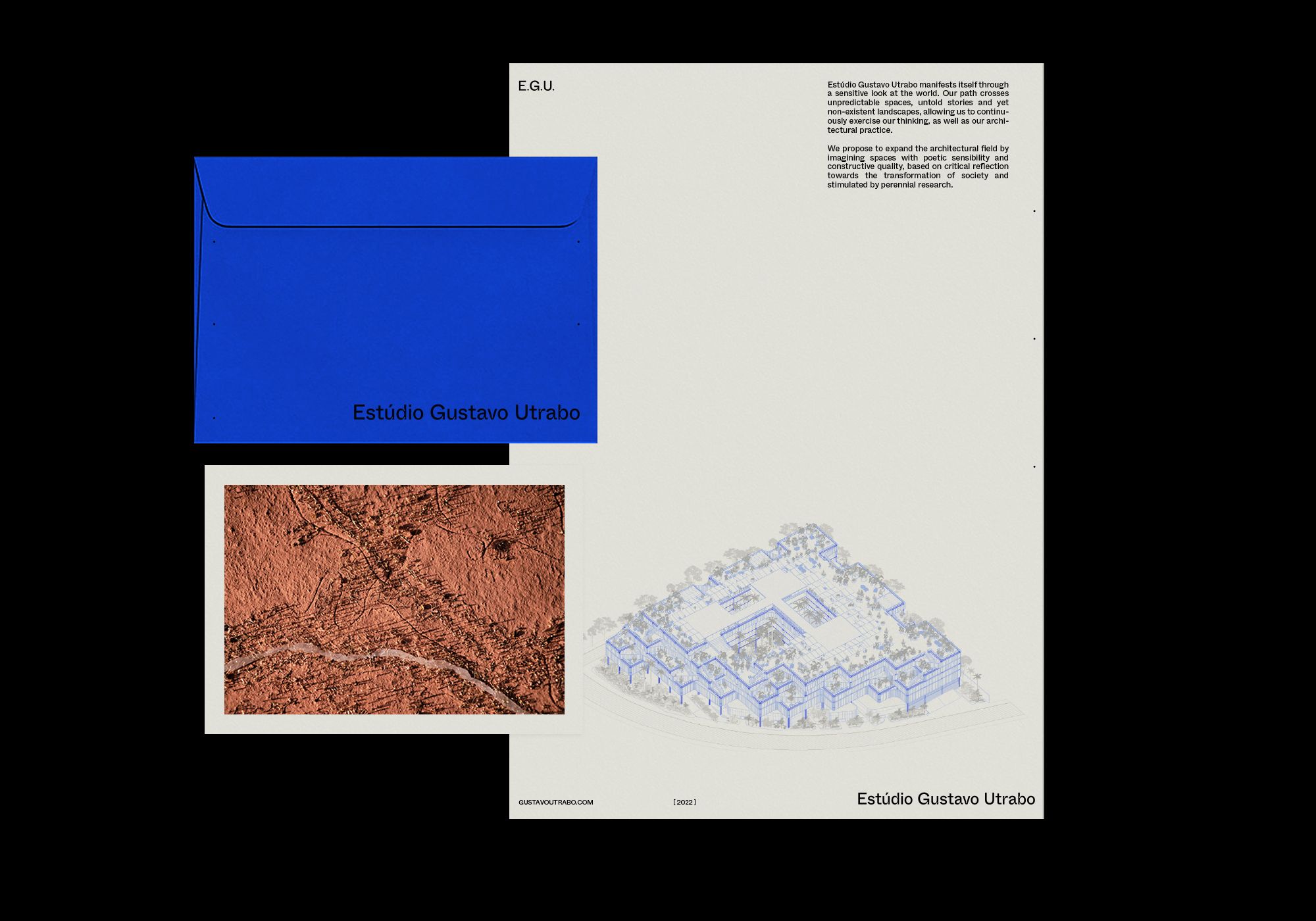
We've defined the color palette through the printed materials and physical element
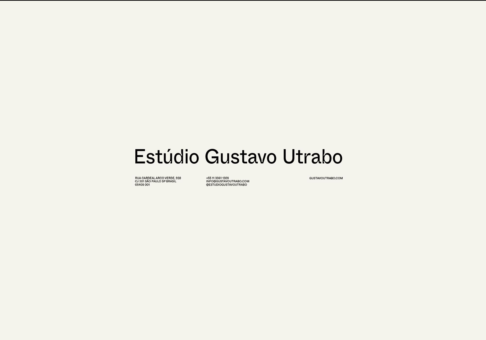
black, white, off-white and little touches of blueThe typography for the logo is the sans-serif typeface Whyte Inktrap, which through its subtle and curved forms brings an architectural dimension to it.
- Brand TypefaceWhyte Inktrap by ABC Dinamo
- Secondary TypefaceDocuman by Displaay Type Foundry
- Creative DirectionBruno Tatsumi
- Graphic DesignAlexandre Ruda & Thalia Carolina
- Web DevelopmentBruno Ishii
